Walkthrough: Joins and pivots
Total suggested time: 30 minutes
So far, you’ve mastered sorting, filtering, functions and other basic spreadsheet operations. But there’s so much more you can do with spreadsheets with the help of a few more advanced features.
Jump to a section
- Scraping data
- Import population data
- Data dictionary
- Naming your tabs
- Defining a ‘join’
- Joins with vlookup
- The pivot table editor
- Using Pivot Tables to create crosstabs
- Calculated fields with pivot tables
Scraping data
For this walkthrough, we’ll be working with long-term care facility outbreak data from the state of Connecticut.
But instead of downloading the data as a file and importing it, we’re going to use one of Google’s built-in scraper functions – IMPORTHTML – to grab the data and drop it right into a new Google sheet.
But before we do that, we’ll need to understand a little more about the function’s syntax:
IMPORTHTML(url, query, index)
The URL (or uniform resource locator) we need is just the link containing the data:
https://explore.covidtracking.com/state/ct/ltc/facilities.html
For query, this function accepts either “list” or “table.” To know which one we need, we’ll need to dig into the guts of the web page. Most web browsers have a tool to do just that!
In your browser, right click on the page to bring up the context menu. There should be an option like “Inspect” or “Inspect element,” and when you click on that, you’ll see a pop-up window with a bunch of code.
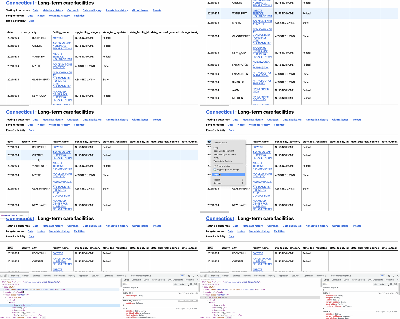
What you’re seeing is the code – hypertext markup language (HTML) and cascading stylesheets (CSS) – that tell your browser how to render the web page you see. And hovering over each of these elements will highlight them on the page.
You’ll see, for example, that hovering over the <table sticky> element highlights our table. And that’s exactly what we want to capture.
In this case, the index is unnecessary since the table we want is the only one on the page.
We should have all the information we need.
Open a new Google Sheet by typing sheet.new in the address bar of a new tab. Don’t forget to rename it and store it in an easy-to-find location on your Google Drive.
In the first cell (A1) enter the following function and parameters:
=IMPORTHTML("https://explore.covidtracking.com/state/ct/ltc/facilities.html","table")
After a few seconds of load time, you’ll see the data fill in to your sheet exactly as it appeared on the web page.
This is incredibly useful for loading in live updating data on the fly. But this data shouldn’t change, so lets do a quick copy/paste to make sure our data stays as is.
- Click on any cell in the sheet and press CTRL + A (PC) or CMD + A (Mac) to select all.
- Right click to bring up the context menu and click
Copy(or press CTRL + C for PC or CMD + C for Mac). - Right click to bring up the context menu and click
Paste Special > Values only(or press CTRL + C for PC or CMD + C for Mac.
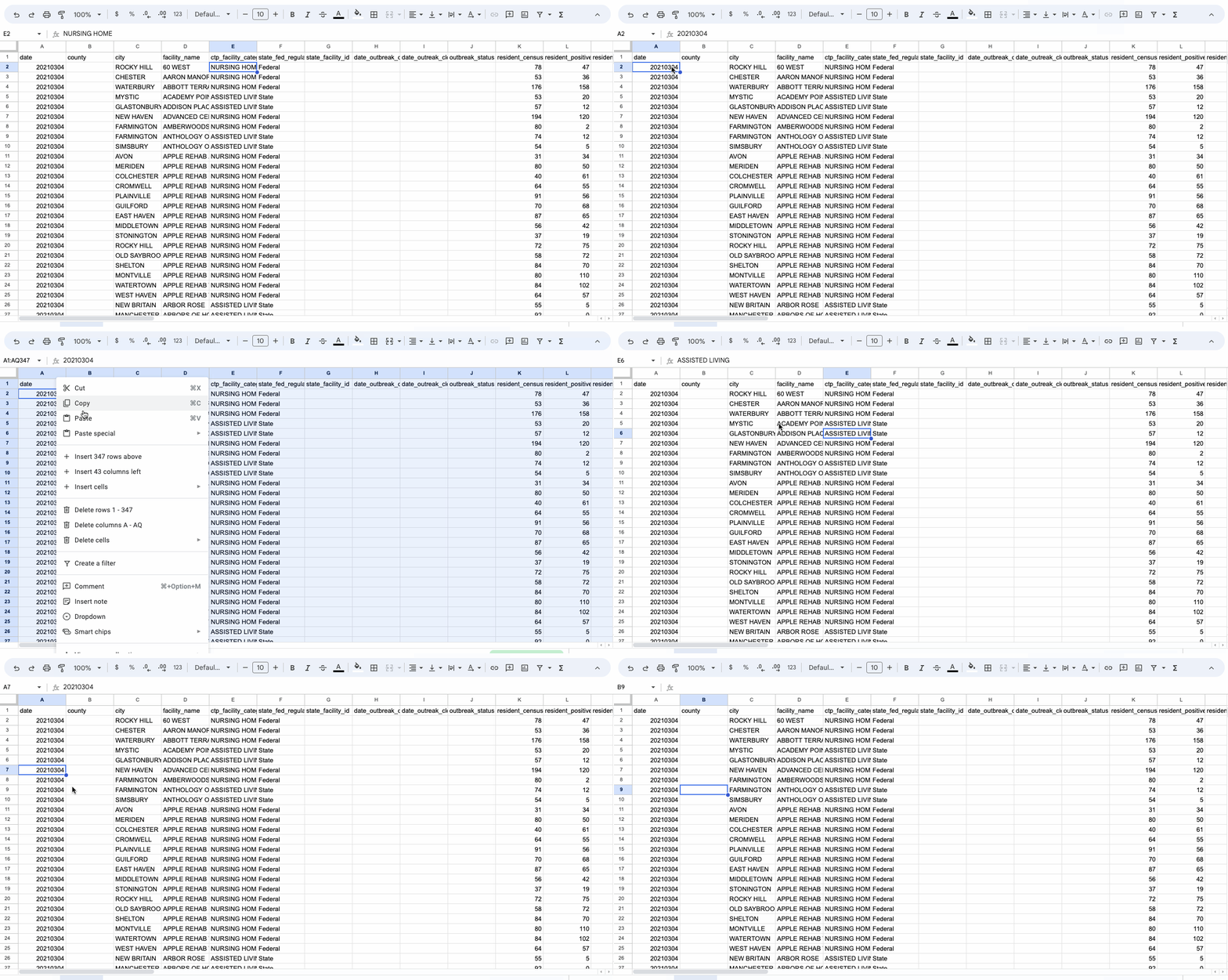
In your A1 cell, you should no longer see your IMPORTHTML formula in the function bar – just plain old data!
Import population data
We’ll also use one additional dataset: 2020 town population estimates from the Connecticut Department of Public Health.
Download a simplified version of the data here.
Then import the data into your existing spreadsheet by choosing Insert new sheet(s) in your import options.
Data dictionary
We’ve got two datasets now, so let’s examine the field layout or data dictionary for each.
Long-term facility outbreak data
Taking stock of the facility data, you might notice a lot of empty fields. The CTP staff actually has a whole page of notes with background on what Connecticut reports and what it doesn’t.
But for now, here’s the data dictionary for the fields actually present in the data that we’ll be focused on, according to the CTP, in this data last recorded March 4, 2021.
city- City where facility resides.facility_name- Name of long-term-care facility.ctp_facility_category- CTP standardized facility types into 3 categories: Nursing Homes, Assisted Living Facilities, and Lumped and Other Facilities.state_fed_regulated- This category notes whether a facility is regulated by the individual state or by the federal government. When “Federal” appears next to a facility, that means it’s a Nursing Home or Skilled Nursing Facility. When “State” appears, it’s an Assisted Living Facility or other facility. When a blank appears, the regulatory body is unknown.resident_census- The number of residents who live at a particular facility.resident_positives- Total number of residents who have ever had a COVID case at a facility.resident_deaths- Total number of resident fatalities with confirmed COVID-19 case diagnosis at a facility.staff_positive- Total number of staff who have ever had a COVID case at a facility.staff_deaths- Total number of staff fatalities with confirmed COVID-19 case diagnosis at a facility.
Connecticut town population data
This is a simplified version of the annual town and county population for Connecticut from the state Department of Public Health
state- Connecticuttown- town nameestimated_population- estimated populations calculated for July 1 of each year and are released by October of the following year.year- 2020
Naming your tabs
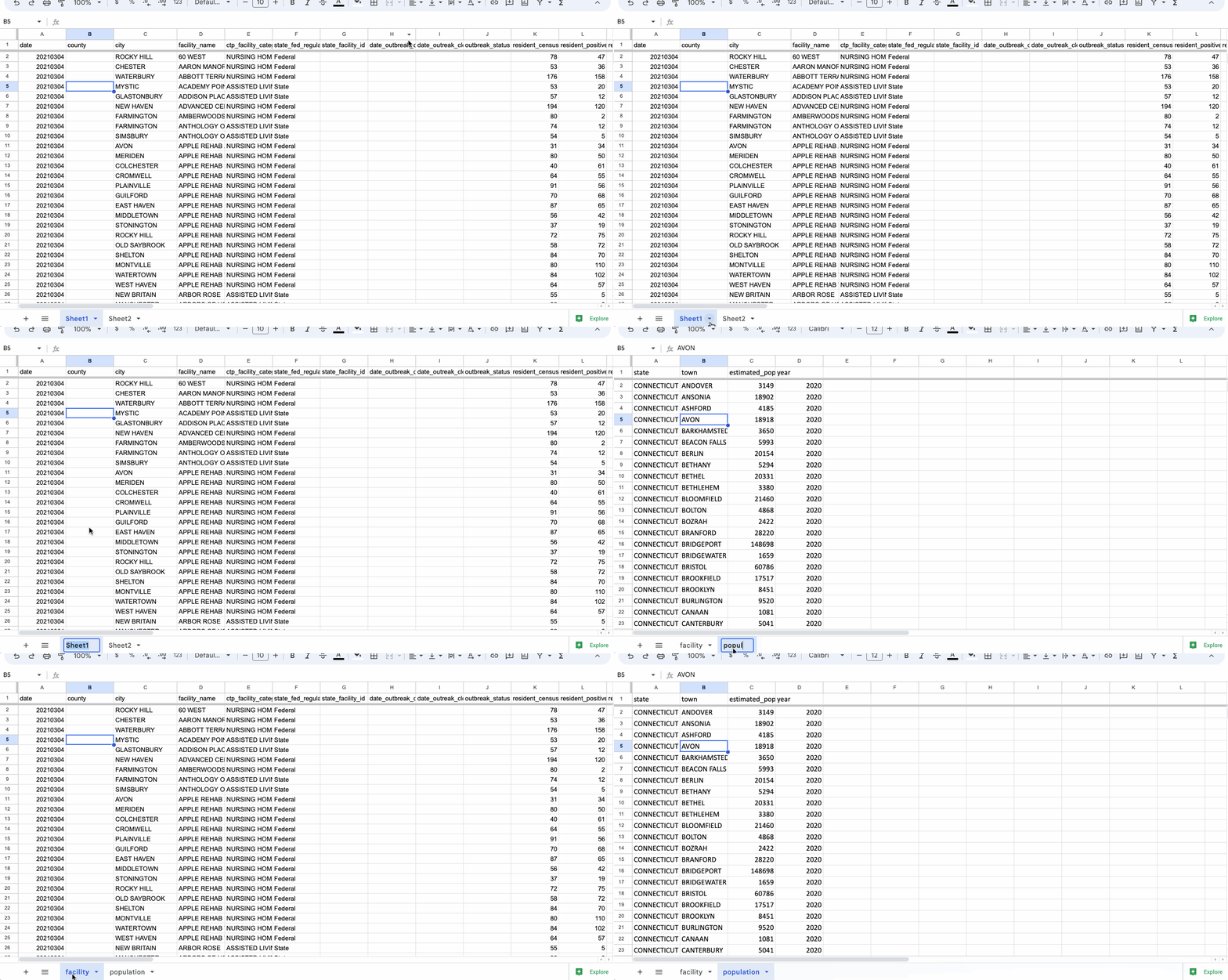
After both scraping and importing your two datasets, you’ll notice your file will have two tabs – labeled Sheet1 and Sheet2 – at the bottom left of the spreadsheet.
In addition to being confusing, these names will actually be important later. Double click on the name, or click on the downward-facing caret and click Rename in the menu.
Following our best practices for naming files (all lowercase, no spaces, short and sweet), let’s name them facility and population.
What is a join?
At this point, we’ve got two separate datasets in two separate sheets, or tabs. If we want to deepen our analysis, we’ll need to join them together.
The term “join” has a very specific meaning in a data science and data journalism context, describing the act of linking one or more datasets together using one or more common columns.
There are a few different techniques to join data, most of which we’ll get to later.
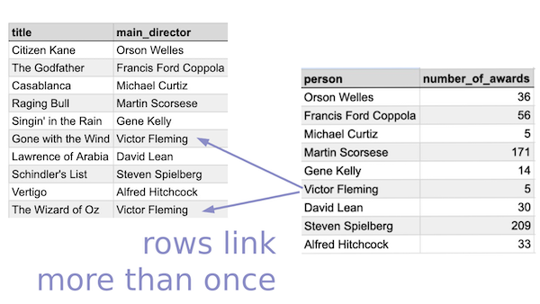
But for now, let’s look at two basic types of joins with a few examples from the American Film Institute’s list of the best movies of all time.
- One-to-one
- Two tables with the same number of rows. Each row in one table matches only one row in the second table.
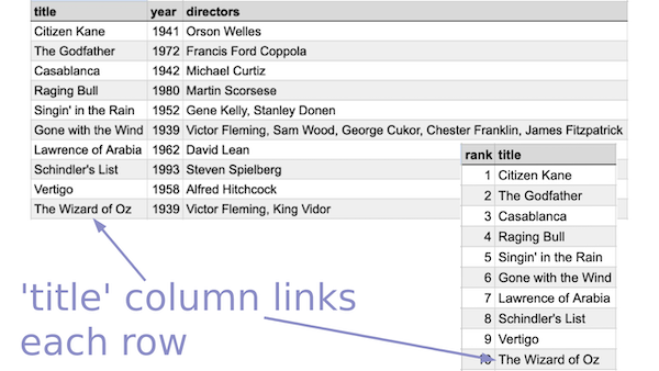
- One-to-many
- Two tables with different numbers of rows. Each row in one table matches to multiple rows in a second table.
Using vlookup to join data
We can use the vlookup function (short for “vertical lookup”) to perform both one-to-one and one-to-many joins across two datasets.
The function accepts three parameters as well as an optional parameter, which is differentiated from the rest with square brackets ([]).
VLOOKUP(search_key, range, index, [is_sorted])
- The search key is the item you want to match in your first and second datasets.
- The range is the second dataset you want to match. The item you’re matching must always be in the first column.
- The index is the column number in the second dataset containing the data you Sheets to bring in to your first dataset.
- The option parameter is_sorted is either ‘TRUE’ or ‘FALSE’, depending on whether or not you want an approximate match. It’s a good idea to always set this to
FALSE, which tells the formula you want an exact match.
Before we experiment with the vlookup function let’s think through the outcome we want:
“Create a column containing the population for each city.”
Based on what we know about spreadsheets and the vlookup formula, executing that outcome might look something like this:
- Create a new column named ‘population’
- Match the ‘city’ column in our ‘facility’ sheet to the ‘town’ column of our ‘population’ sheet
- For each match, retrieve the data from the ‘estimated_pop’ column of our ‘population’ sheet
- Enter the matched data into the ‘population’ column of our ‘facility’ sheet
Let’s translate those actions into the spreadsheet!
In the facility tab of our Connecticut facility data, insert a new column to the right of city. Name it population.
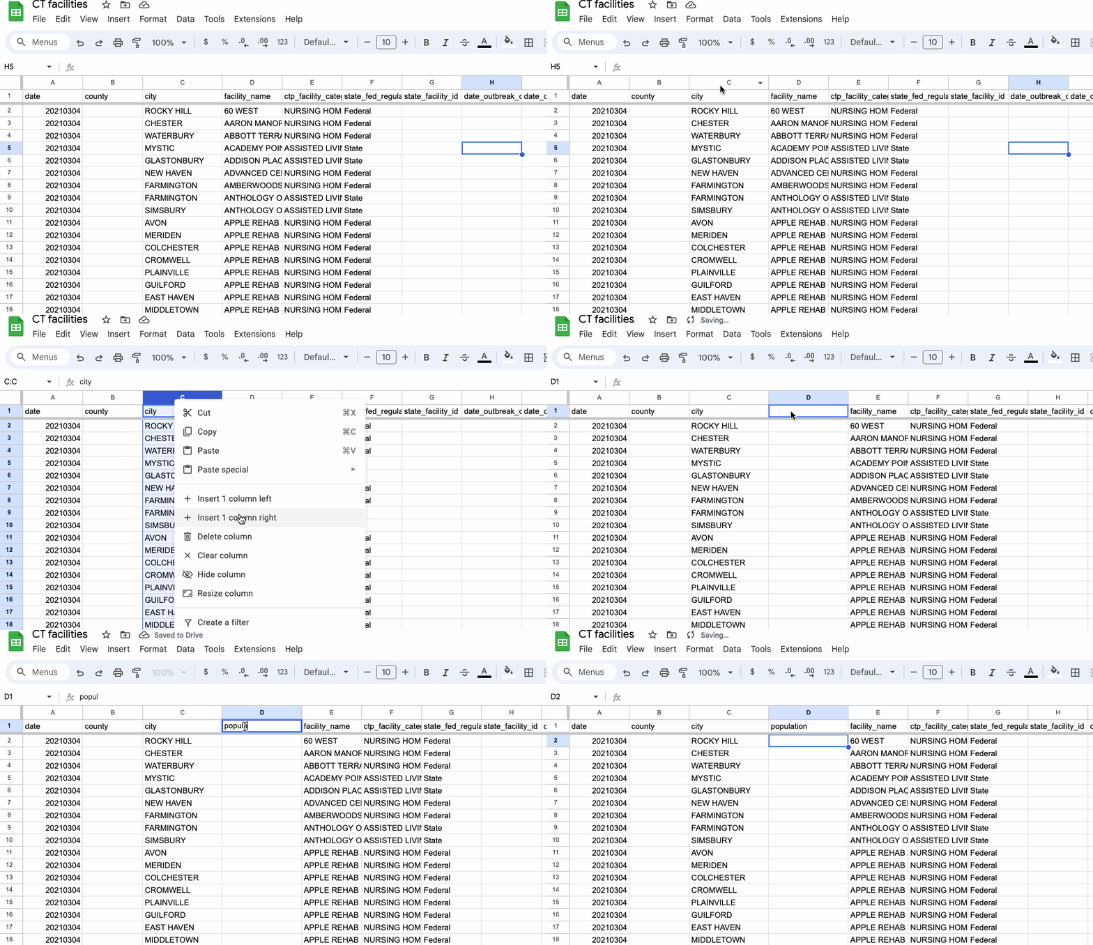
In the first row of our new population column, type or paste in the following formula:
=VLOOKUP(C2, population!B:C, 2, FALSE)
To decode that formula a bit:
=VLOOKUP(Call our functionC2,Define the search key as the city column in our facility sheetpopulation!B:C,Define the range as the population sheet, starting with the town column (B), where were want our search key to match, and extending to the next column containing the estimated population2,Get the data from column with index 2, the second column of the range we just defined containing our estimated populationFALSE)Provide an exact match
When we do a fill down (or autocomplete when prompted by Sheets), you should see the joined values appear for the rest of the column.
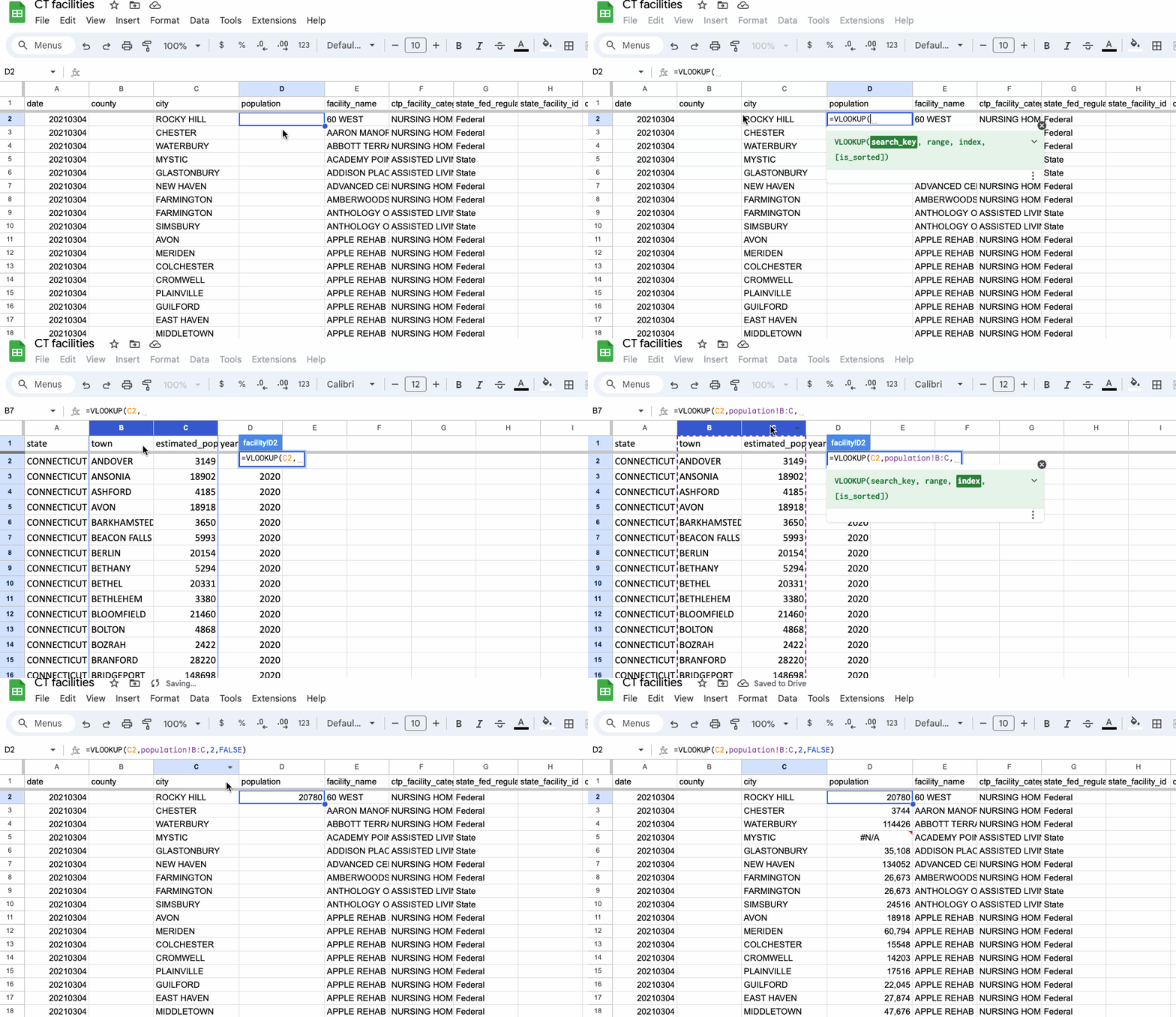
Success! Well, sort of.
Do you spot any errors? How about on rows where the facility is located in Mystic, Conn.? Or Southport? Or a town called “MARLBOROUG H”?
The last one is an obvious typo. If you fix it by deleting the space before the “H”, you should see the value fill in automatically.
But the other two are less obvious. Hover over the error in the cell to trigger the tooltip to see what’s wrong.

If you navigate over to your population sheet, you’ll notice that there is no population value for Mystic or Southport.
Turns out these are places smaller than towns in Connecticut, so the state data we’re using doesn’t track their population!
We’ll leave them alone for now, but it’s worth noting as we think through how we do comparisons later.
The pivot table editor
What sort of patterns might emerge from this data among the facilities in a given city? Or among facilities of a certain type?
These are questions we can try to answer when we group and summarize variables using a special feature of spreadsheet software called Pivot tables.
To get started, click “Insert” in the top menu, then “Pivot table.” By default, the resulting dialogue will select your current sheet and will ask if you want to insert the result in a new sheet.
Click “Create.”
What Sheets shows us next is a special kind of table that looks and feels different than the normal rows and columns we’ve seen so far.
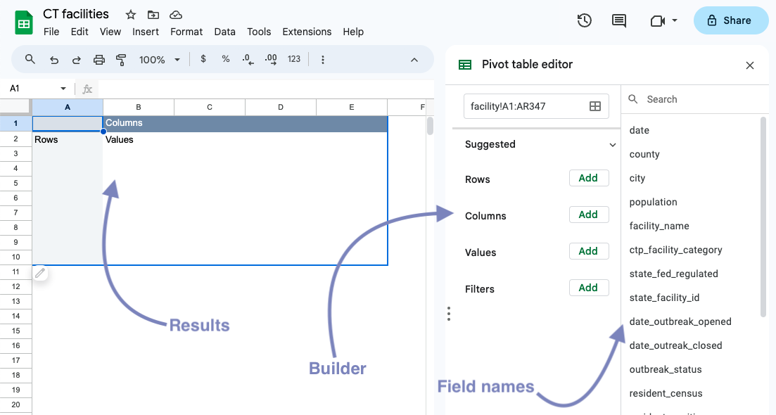
In pivot tables, instead of manually working with data, we’ll largely use the editor/builder, work with field/column names and produce data that’s piped into the results section.
To see how this works, try dragging and dropping one of the field names (like facility_name) into the Rows section of the builder.

Under the hood, your pivot table is grouping your data – in this case by facility_name – and displaying each unique value row by row in the results panel.
To sort the data, click “Sort by” in the “Rows” section of the panel and select the field you want to sort, along with its sort order (ascending, for A-Z, or descending, for Z-A).
It might look identical to your original data, but notice that there are only 341 rows of facility names (minus the header and the Grand Total row), where your source data has 346 rows.
That’s because a few of your facility names are repeated! WHITNEY CENTER, for example, is listed twice in the same city.
You can click the X button in the builder to remove the field and start over.
It’s important to know that the pivot table is effectively cordoned off – nothing you do on this tab will impact your source data. That makes it an effective sandbox for exploring the data quickly and anxiety-free!
Using pivot tables to create crosstabs
The true power of pivot tables is the ability to aggregate data across groups of variables.
Say we want to know, for example, whether federal- or state-regulated long-term care facilities saw more deaths from COVID-19.
- Start by dragging the
state_fed_regulatedfield into “Rows.” - Then, drag
resident_deathsinto “Values.”
You’ll see the two unique values of the state_fed_regulated column (“Federal” and “State”) show up in your new table, along with a SUM of the resident_deaths column.
Sheets just guessed, when you dragged the numerical resident_deaths field into your Values section, that you wanted to sum the values. But you can select other types of summarization functions (COUNT, AVERAGE or MEDIAN to name a few).
If you want to see more than one of those summarization functions at the same time, you can drag the resident_deaths field to “Values” again and select something different.
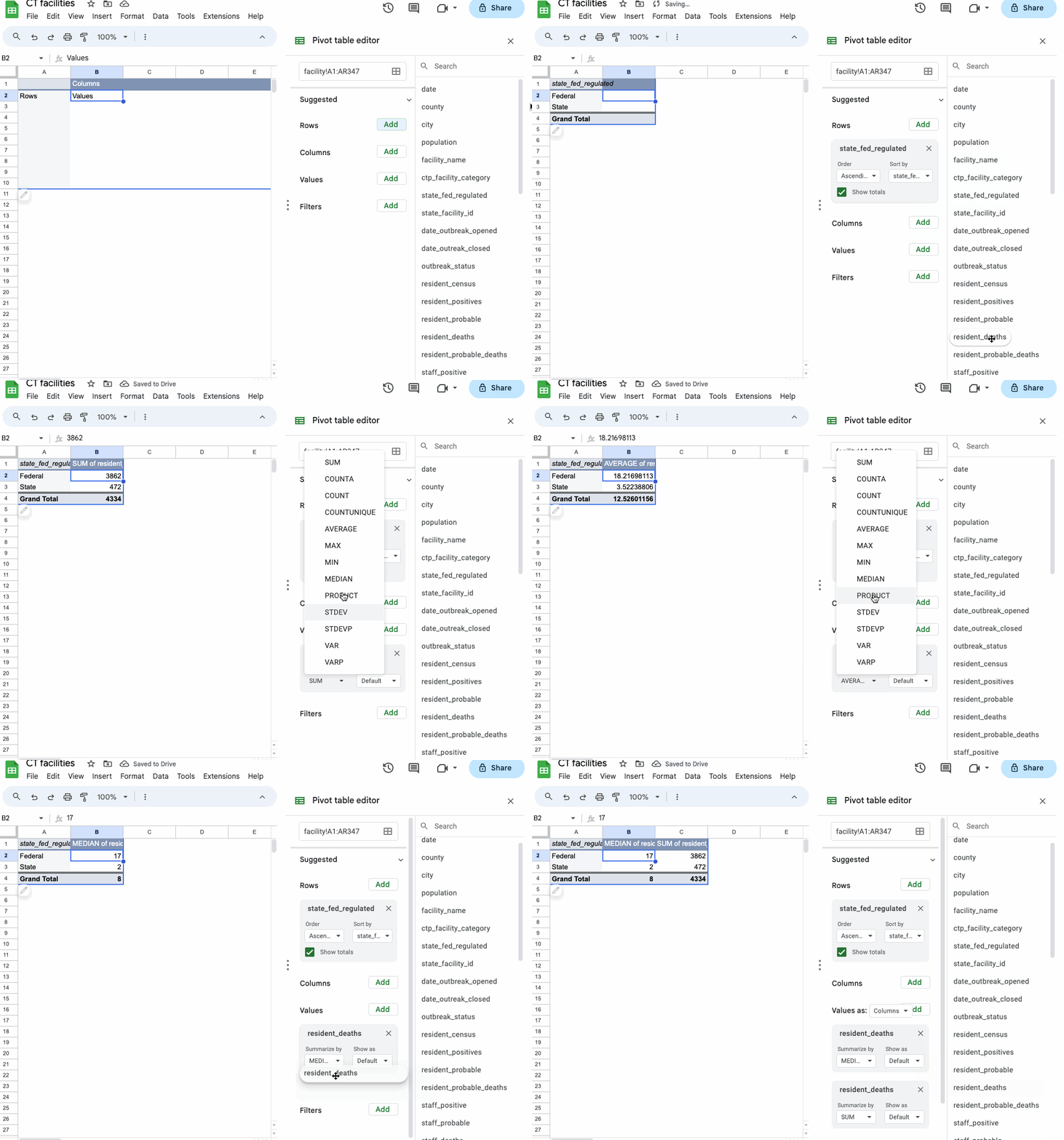
You can also layer categories of data in subcategories by adding more fields to “Rows” or compare them by adding the field to “Columns”.
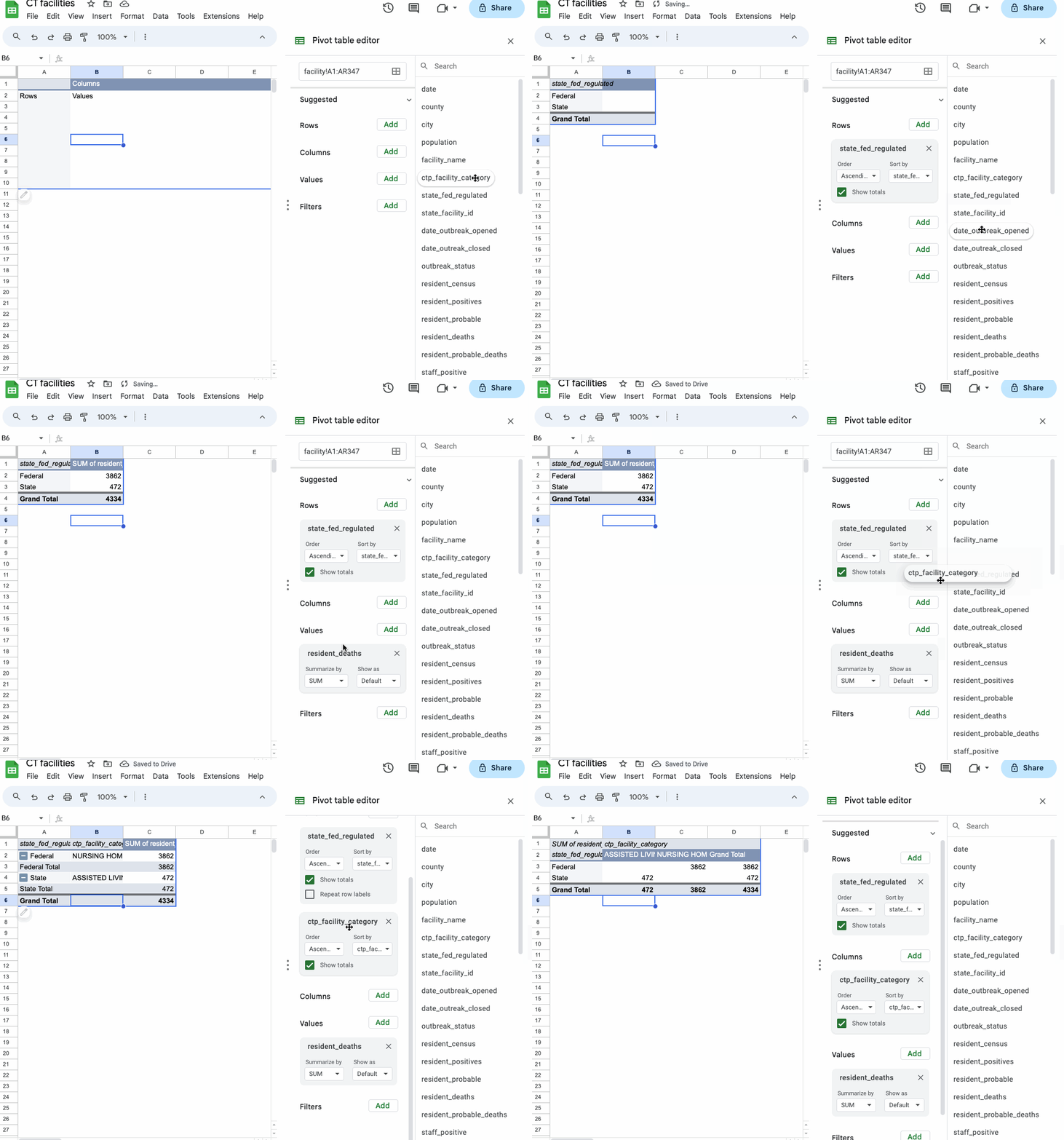
In this case, working with the additional ctp_facility_category field just shows us that the facilities are called “nursing homes” if they’re federally regulated and “assisted living” if they’re regulated by the state.
While that’s not particularly useful to us, we can delete the field from our results without much trouble.
Creating calculated fields in pivot tables
A raw count of deaths or cases is somewhat useful in understanding the scope of outbreaks in Connecticut long-term care facilities. But how do we know the number of patients is comparable?
Let’s add up both the number of residents and the number of cases in each type of regulated facility. Add state_fed_regulated to “Rows”, then resident_census and resident_positives to “Values.”
Now, we can calculate an infection rate per patient to get a more comparable figure.
In “Values” section, click the “Add” button, then “Calculated Field.” You’ll see a new box appear with a blank formula, where you’ll paste this and hit enter:
=resident_positives / resident_census * 100
You should see a figure calculated in the results section.
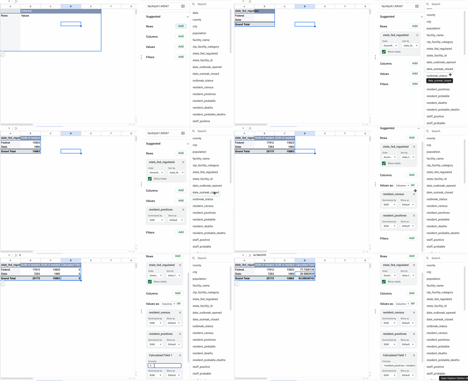
By default, calculated fields group your data by the fields you set in “Rows” and summarize your results with the SUM function.
So you typed the function above into the “Formula” field, but pivot table actually calculates the result by adding up those variables from all the facilities in each group (federally-regulated or state-regulated) and then executes your formula:
=SUM(resident_positives) / SUM(resident_census) * 100
But you can customize that behavior, to create more complex analyses.
Suppose, for example, you want to explore the relationship between city population and deaths in facilities due to COVID. We wouldn’t want to add up the city population multiple times before we calculate the rate.
Because the population is the same across city, we can introduce another type of aggregation function that only uses the population once (like MAX, MIN, etc).
Starting with a clear pivot table, drag city into “Rows”, then population and resident_deaths into “Values.”
In the population box, set “Summarize by” to the MAX function. You can leave resident_deaths with the default SUM.
Now, add a calculated field with the following formula.
=SUM(resident_deaths) / SUM(resident_census) * 100
Change “Summarize by” to Custom and you should see your calculated field change to show the rate of deaths per population.