Walkthrough: Investigating disparities in R
Total suggested time: 30 minutes
Numbers out of context often aren’t enough to help us inform our audiences. In this walkthrough, we’ll use joins and a little math to create comparisons we can use to probe for disparities.
Jump to a section
- Getting set up
- Downloading and importing the data
- Creating comparisons
- Understanding joins
- Creating clean keys for joins
- Executing the join
- Calculating rates
- Disparity ratios
- Get the full script
Getting set up
Create a new R project called covid_disparities.
Create a new folder in your project directory called data.
And start a new R script in your main project directory, and Save as... with a name of your choice.
Load our Tidyverse package, which we should already have installed
#load our packages from our library into our workspace
library(tidyverse)
Downloading and importing the data
The data we’ll be working with for this walkthrough comes from the COVID Tracking Project’s race and ethnicity file for Nevada, portions of which we’ve already used.
Download the CSV file here and save it to the data folder in the R project directory you created above.
Once our file is saved, we’ll load it into a new dataframe called covid_race_nv with a function from our Tidyverse package.
#load in our us covid data
covid_race_nv <- read_csv('data/all-states-history.csv')
Take note that in your “Environment” window (by default in the top right), you should be able to see your covid_race_nv dataframe with more than 20,000 rows and 41 variables.
We’ll need one more dataset. This one is the race and ethnicity breakdown of the Nevada population, according to the 2020 5-year American Community Survey.
Download the file and save it to your project file’s data directory. Then import the data into your workspace using a similar command to the one above.
#load in nv race and ethnicity population data
census_race_nv <- read_csv('data/nv_race_ethnicity_census.csv')
This is a pretty small file: just 9 rows and 3 columns.
Creating comparisons
There’s a lot we can do with these two separate datasets, especially if we’re interested in better understanding the unequal impacts of COVID-19 on different racial and ethnic groups.
And the math is pretty simple.
But before we get to the equations – and the code – it can help to think through in plain language what we want to find out. For example:
How does the percentage of Hispanic COVID-19 deaths compare to the percentage of Hispanics in Nevada overall?
Single question, two numbers to compare. And a good, quick indicator of what a disparity might look like.
Let’s tackle the first part:
What percentage of total COVID-19 deaths in Nevada were identified as Hispanic?
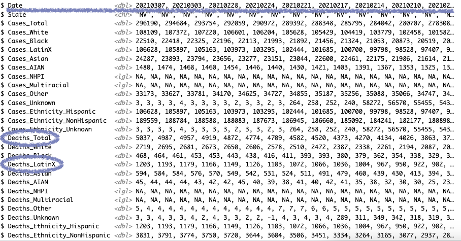
We know we’ll get that from our COVID data, but we can use glimpse() to get a quick look at which fields we want to use to make our calculation.
#get a quick look at the fields in our data
covid_race_nv %>%
  glimpse()
A few things to note here:
- Judging by the
datefield, this is another time series dataset, and our most recent total is in the first row - Our total is in the
Deaths_Totalfield - Our Hispanic figure is in the
Deaths_Hispanicfield

We don’t actually need a complex Tidyverse chain of commands here. We just need a few special operators R uses to access data inside our dataframe.
The next two lines of code tell R we want the list of values from specific columns (using the $ operator) and the value from the first row only (the [[]] notation). And in this case, we want essentially the same thing from two different columns.
#store the numerator and denominator
hisp_deaths <- covid_race_nv$Deaths_LatinX[[1]]
total_deaths <- covid_race_nv$Deaths_Total[[1]]
Now we can calculate a percentage with the numerator and denominator and a little rounding.
#calculate the proportion of total deaths as a percentage
round(hisp_deaths / total_deaths * 100, 1)
Hispanic residents in Nevada made up 24% of COVID-19 deaths.
Let’s move on to the next question.
What percentage of Nevada residents are Hispanic?
View the dataframe by clicking on the census_race_nv in your environment pane.
The data in this simplified census table is formatted a little differently, but we can use similar code to pull the values we need, which happen to be in the estimate column this time, and the 1st and 9th rows. So we can adjust our commands accordingly.
#store the population numerator and denominator
hisp_pop <- census_race_nv$estimate[[9]]
total_pop <- census_race_nv$estimate[[1]]

#then calculate the proportion as a percentage
round(hisp_pop / total_pop * 100, 1)
Hispanic residents in Nevada were about 29% of the population in 2020.
So:
Hispanic residents in Nevada made up 24% of COVID-19 deaths, despite making up 29% of the population there.
Not much of a disparity there it appears. What about the other racial groups?
We could repeat these steps, but the process is a little tedious. What if we make a similar calculation for every racial group all at once?
Understanding joins
Before we get there though, let’s talk about joins.
At their core, joins in data journalism and data science (or any other field that works with databases) is just a way to link two datasets together using a common, matching field – often called a key.
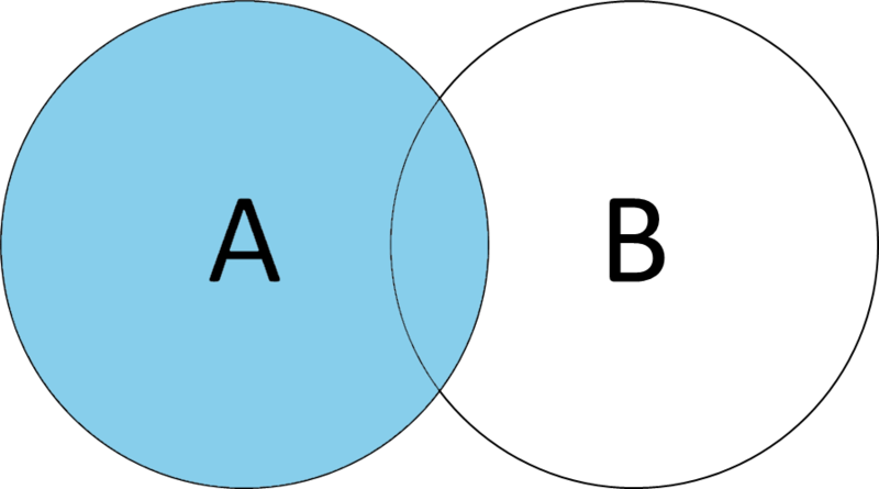
There are lots of types of joins, but for this analysis, we’ll use a left join.

Left joins preserve the entirety of Database A, adding any elements of Database B where the keys match. Think of A, or your left side, as your primary data, while B, on the right side, is supplementary information you want to add.
Following that guideline, our lefthand dataset should be covid_race_nv and our righthand dataset should be census_rate_nv.
Creating clean keys for joins
We’re going to match on the race/ethnicity label. But you may have already noticed that the two datasets use different labels – a literal join won’t match Black with Black or African American.
So we need to do a little data cleaning first.
We already know we can simplify. We only need the most recent date, so we can filter for that. We can also remove all the columns we don’t need with select(). But instead of typing out all of the death columns, we can actually take advantage of a little convenience function called starts_with() to only give us fields starting with Death_.
#testing out some data simplification
covid_race_nv %>%
  filter(Date == '20210307') %>%
  select(starts_with('Deaths_'))
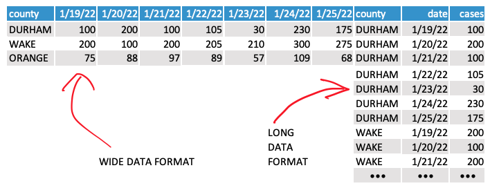
We also need one more new function: pivot_longer().
This data is currently “wide.” We need it to be “long” to get it to match up with our census datasets.

And that’s where pivot_longer() can help – it basically just transposes the data based on a few parameters:
cols- the columns you want to transposenames_to- name of the new column where your old column names govalues_to- name of the new column where the values in your old columns go
In our code, we’ll define cols using another convenience function called everything() that returns all the columns at once. We’ll also use an optional parameter, names_prefix, to remove the unnecessary Deaths_ text from our race/ethnicity label.
#simplify and reformat the covid data
covid_race_match <- covid_race_nv %>% #store clean data into a new variable
  filter(Date == '20210307') %>% #get the most recent date
  select(starts_with('Deaths_')) %>% #simplify by selecting death columns only
  pivot_longer(cols = everything(), #specify the columns you want to transpose
               names_prefix = 'Deaths_', #provide a prefix to remove (optional)
               names_to = 'label', #name of the new column where your old column names go
               values_to = 'deaths' #name of the new column where the values in your old columns go
               )
Now onto the right side of our join. This data is mostly fine, but we’ll need to standardize the labels so we’re sure they’ll match with our COVID data. To do that, we’ll create a new dataframe using the case_when() function.
Basically just a cleaner form of the if/then statement, case_when() allows us to take every wrong label and turn it into the right one. We’ll use the labels in our covid_race_match dataset to make those corrections.
Notice, with the code below, that we don’t need to fix all of the labels, only the ones that don’t match. To catch everything else, we’ll just set a .default parameter that sets anything that doesn’t match to the original label text.
#clean census data with matching covid labels
census_race_match <- census_race_nv %>%
  mutate(label = case_when(
    label == 'Black or African American' ~ 'Black',
    label == 'American Indian and Alaska Native' ~ 'AIAN',
    label == 'Native Hawaiian and Other Pacific Islander' ~ 'NHPI',
    label == 'Some other race' ~ 'Other',
    label == 'Two or more races' ~ 'Multiracial',
    label == 'Hispanic or Latino' ~ 'LatinX',
    .default = label
  ))
Now, we’re ready to join.
Executing the join
In the Tidyverse, the left_join() function accepts two dataframes (left and right) and a by parameter, which tells the function what keys actually want to match on.
Since we’re using the Tidyverse pipe syntax (%>%), we’ll start with the left dataframe (covid_race_match), then feed in the righthand dataset (census_race_match). For the by parameter, we’ll pass in the column names of the keys we’re matching, which in this case are both named label.
#join the census and covid data
covid_race_joined <- covid_race_match %>%
  left_join(census_race_match, by = c('label' = 'label')  )
Calculating rates
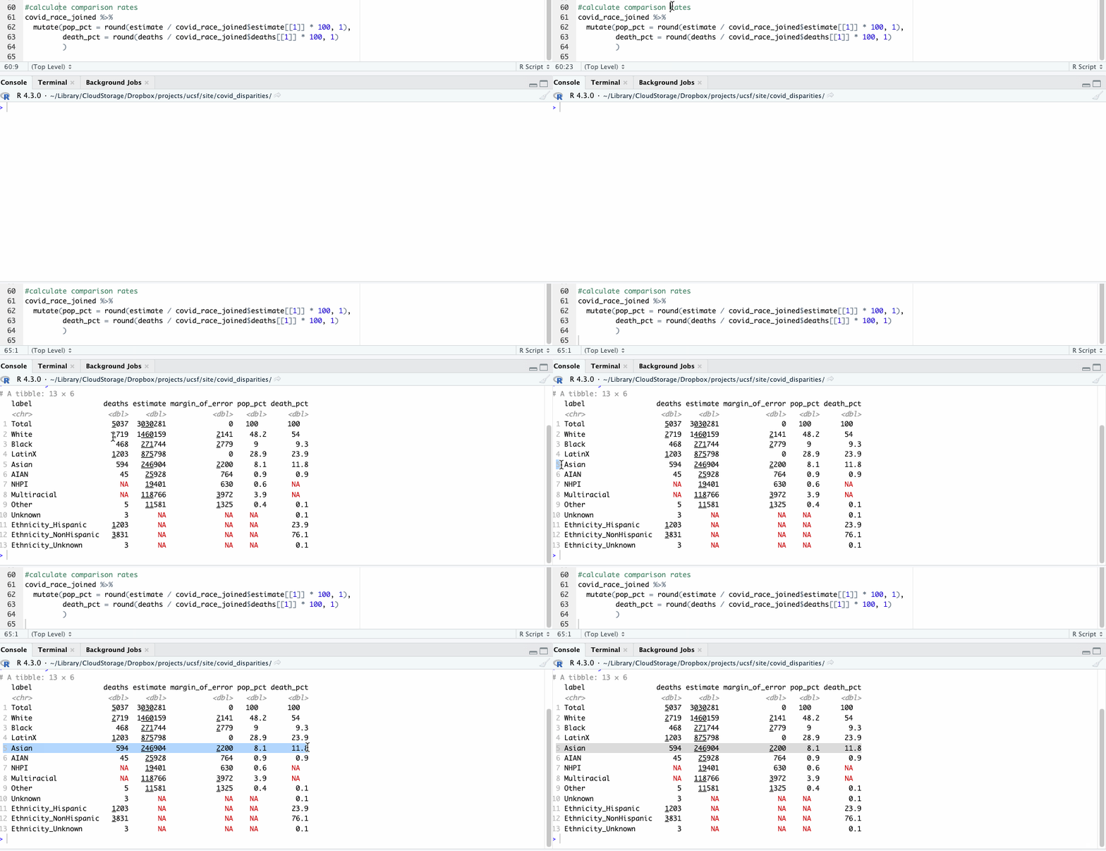
Now, repeating our earlier check of disparities only takes a few lines of code that we can apply across all racial groups.
#calculate comparison rates
covid_race_joined %>%
  mutate(pop_pct = round(estimate / covid_race_joined$estimate[[1]] * 100, 1),
         death_pct = round(deaths / covid_race_joined$deaths[[1]] * 100, 1)
         )

Let’s take a closer look at those numbers and see what they show. For our purposes here, we’ll focus on some of the larger racial groups to avoid the problem of small numbers, where tiny variations have bigger impacts.
| label | deaths | population | pop_pct | death_pct |
|---|---|---|---|---|
| White | 2,719 | 1,460,159 | 48.2 | 54.0 |
| Black | 468 | 271,744 | 9.0 | 9.3 |
| LatinX | 1,203 | 875,798 | 28.9 | 23.9 |
| Asian | 594 | 246,904 | 8.1 | 11.8 |
Like before, we see where Hispanic deaths don’t seem to show a significant racial disparity. Nor do Black deaths.
The deaths of White and Asian residents, however, seem overrepresented here. White people made up 54% of deaths, but 48% of the population. Asian people made up about 12% of the deaths, but about 8% of the population.
But because the size of the populations is so different, it’s difficult to compare the two directly.
But we can compare them if we calculate the rates of death relative to the population of the racial group, rather than the total. That calculation looks like this:
White resident deaths / white resident population

Asian resident deaths / Asian resident population
In R, we can add in this new calculation as another column so we can see everything at once. Notice that in the code below, we don’t need to use the $ operator – we want the population estimate for each racial group, not the total.
#calculate comparison rates by subgroup
covid_race_joined %>%
  mutate(pop_pct = round(estimate / covid_race_joined$estimate[[1]] * 100, 1),
         death_pct = round(deaths / covid_race_joined$deaths[[1]] * 100, 1),
         death_rate = deaths / estimate
  )
So are findings are 0.00186 for white residents and 0.00241 for Asian residents. What does that mean?
Disparity ratios
We just calculated the rate of COVID deaths per population. But we can make those findings a lot more readable.
Where we’d normally multiply the result by 100 to calculate the percentage, we’re dealing with much smaller numbers here. Instead, we’ll multiple them by 100,000 and round the result.
#calculate comparison rates by subgroup with rounding
covid_race_joined %>%
  mutate(pop_pct = round(estimate / covid_race_joined$estimate[[1]] * 100, 1),
         death_pct = round(deaths / covid_race_joined$deaths[[1]] * 100, 1),
         death_rate = round(deaths / estimate * 100000, 1)
  )
100,000 here is a methodological decision – we could have used 1,000 or even 10,000 – but the goal is to transform the resulting rate into a number that is readable and shows a reasonable amount of precision. For population comparisons, 100,000 is generally acceptable.
With that adjustment, we’ve now calculated the rate of COVID deaths per 100,000 population. That’s still a bit of a mouthful, but we can also clearly compare the disparities we’re seeing among the different populations in the state – 186 for white residents vs. 241 for Asian residents.
That’s compared to 166 deaths per 100,000 of the total population. So clearly Asian COVID patients are dying at a higher rate than the total population.
But we can go even further. Now that we can compare rates directly, we can calculate the disparity ratio between any group.
Rate of COVID deaths per White population / Rate of COVID deaths per total population
186 / 166
1.12

Rate of COVID deaths per Asian population / Rate of COVID deaths per total population
241 / 166
1.45

Rate of COVID deaths per Asian population / Rate of COVID deaths per White population
241 / 186
1.30
Now we can say that, based on the data:
- White Nevada residents are dying at rates about 12% higher than the overall population
- Asian Nevada residents are dying at rates about 45% higher than the overall population
- Asian Nevada residents are dying at rates about 30% higher than the overall population
Any one of those findings could be a story worth exploring.
And now that you know how to do it for one state, you can repeat the process for any state with similar data to find where the disparities are the highest and lowest.
Get the full script
Download the full script for this walkthrough here.