Walkthrough: Data visualization in R
Total suggested time: 30 minutes
It can often be helpful to look for visual patterns when analyzing data. In this walkthrough, we’ll explore a few different R packages that can help us quickly create simple, but powerful visualizations.
Jump to a section
- Getting set up
- Downloading and importing the data
- Recapping grouping and summarizing
- Getting started with
ggplot - Simple line charts
- Adding style to graphics
- Calculating rolling averages
- Combining different geoms
- Patterns in small multiples
- Get the full script
Getting set up
Create a new R project called covid_viz.
Go ahead and create a new folder called data in our project directory.
And start a new R script in your main project directory, and Save as... with a name of your choice.
We should have most of our packages already installed, but we’ll use a few more in this walkthrough.
#install other packages
install.packages('zoo') #handy set of functions for advanced calculations
install.packages('geofacet') #neat tools for visualization
Load our Tidyverse package and any others.
#load our packages from our library into our workspace
library(tidyverse)
library(zoo)
library(geofacet)
Downloading and importing the data
The data we’ll be working with for this walkthrough comes from the COVID Tracking Project’s state-by-state testing & outcomes file, portions of which we’ve already used.
Download the CSV file here and save it to the data folder in the R project directory you created above.
Once our file is saved, we’ll load it into a new dataframe called covid_time_series with a function from our Tidyverse package.
#load in our us covid data
covid_time_series <- read_csv('data/all-states-history.csv')
Take note that in your “Environment” window (by default in the top right), you should be able to see your covid_time_series dataframe with more than 20,000 rows and 41 variables.
Recapping grouping and summarizing
Before we dig into visualization, let’s review a few concepts from the previous “Intro to R” module.
For this analysis, we’ll be using the Tidyverse “pipe,” which looks like this %>% to chain together operations on our data.
We can see there’s a lot of data here. Let’s run a quick check of North Carolina using the filter(), then the nrow() functions.
#count the number of rows for NC only
covid_time_series %>%
  filter(state == 'NC') %>% #filter for North Carolina
  nrow() #count the rows
That should return a value of 369 – so there are more than a year’s worth of daily observations for that state.
== symbol we're using in our filter() function? It's one of the standard logical comparisons used across programming languages:
==equal to!=not equal to>greater than<less than>=greater than or equal to<=less than or equal to
What about all the others? To answer that, we can employ the group_by() and summarize() functions, counting the number of observations state by state with n().
#get the count of rows/observations for each state
covid_time_series %>%
  group_by(state) %>% #group by state postal abbreviation
  summarize(count = n()) %>% #summarize by group and count
  arrange(desc(count)) #arrange in descending order
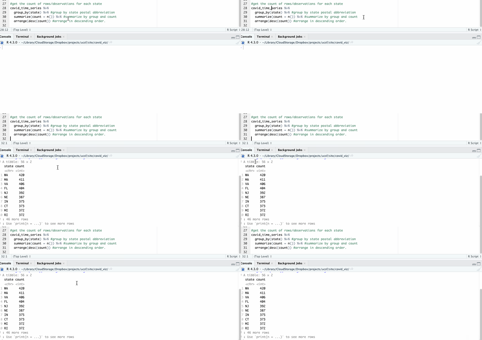
The resulting table shows 56 groups – so we know this likely includes both states and U.S. territories.
Let’s use the filter() function to carve out a single state – North Carolina – so we can use it a little later.
#create a separate dataframe for North Carolina
covid_nc <- covid_time_series %>% #assign the output to new variable
  filter(state == 'NC') %>% #filter by NC postal abbrev
  arrange(date) #arrange by date
For more on grouping and summarizing and other R basics, check out the previous module.
Getting started with ggplot
We’re going to use ggplot, a package that works in tandem with the Tidyverse, to do some of our charting and graphing.
It’s name originates from The Grammar of Graphics, a 1999 textbook on creating graphics for everything from scientific journals to newspapers.
The underlying premise of the package is that every visualization needs three basic building blocks:
- Data - some set of observations in rows and columns
- A coordinate system - think the x/y plot on a basic chart
- Visual marks, or geoms - could be dots on a scatter plot, bars on a bar graph or polygons on a map
These pieces can be added together, layer by layer, to construct a wide array of charts and graphics with near infinite customization.
Simple line charts
Let’s see how that works in action by generating a simple line chart of COVID-19 cases over time.
In the parlance of ggplot, we can imagine how to use those basic three building blocks to piece together this graph:
- Data: COVID-19 cases in North Carolina
- Coordinate system: X-axis as dates and Y-axis as count of cases
- Geom: A line
Translated into code, those three pieces look like this:
#display a simple line chart of case counts
ggplot(covid_nc) + #input the data
  aes(date, positive) + #define the x and y axes
  geom_line() #use lines as visual marks
ggplot()initiates the plot with a datasetaes()(short for “aesthetics”) describes how the variables in your data map to the visual look and feelgeom_line()is one of several “geom” functions that specify what visual marks you want to use
After this runs, you should see this in the “Plots” pane in the lower right-hand corner of your R Studio workspace.
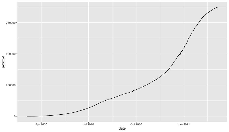
There are a few different ways you can rearrange the code to make it a little easier to use with the tidyverse while getting the same output. We’ll generally use a style like this so that we can work with the data before piping it to ggplot.
#an alternative method of charting a line chart with a plot
covid_nc %>% #input our covid data
  ggplot(aes(date, positive)) + #define the x and y axes
  geom_line() #use lines as visual marks
+ symbol and the %>% symbol. The ggplot package works by adding different elements to the plot vs. chaining the output of one function to the next, like the pipe operator does.
Adding style to graphics
Let’s introduce a few styling elements to label and clean it up.
Like with the required elements of ggplot, styling is added layer by layer. You can scale the x-axis by specifying the intervals you want to show and how you want the labels to look. You can add a title and caption to the graph and label the axes. And you can modify the theme by adding or removing individual elements.
Try running the following code.
#make a prettier plot by adding in styling in ggplot
covid_nc %>%
  ggplot(aes(date, positive)) + #define the x and y axes
  geom_line(color = 'blue') + #make a line chart and define the color
  scale_x_date(date_breaks = '2 months', date_labels = "%b %y") + #specify a date interval
  labs(title = "COVID-19 positive cases in North Carolina", #label our axes
       caption = "SOURCE: COVID Tracking Project",
       x = "",
       y = "Case count") +
  theme(strip.text.x = element_text(size = 10), #do a little styling
        strip.background.x = element_blank(),
        axis.line.x = element_line(color="black", linewidth = 0.25),
        axis.line.y = element_line(color="black", linewidth = 0.25),
        panel.grid.major.x = element_line( color="grey", linewidth = 0.25 ),
        panel.grid.major.y = element_line( color="grey", linewidth = 0.25 ),
        axis.ticks = element_blank(),
        panel.background = element_blank(),
        plot.title = element_text(size = 12),
  )
That’s a little better!
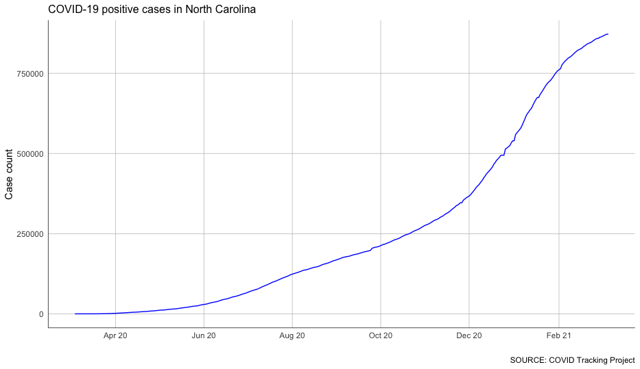
It’s not necessary to know the ins and outs of each of these style modifications – there are way too many to commit to memory at this point, and you can always look them up in ggplot’s documentation.
For now, try experimenting with what changes when you comment out lines and rerun the code.
Calculating rolling averages
We can certainly see some patterns in this data, but it’s a bit difficult. That’s because we know that the COVID-19 case counts grow over time – case counts don’t go down, they go up.
What we’re more interested in is how much that count grows over time. So we need to look at new cases more closely.
To do that, we’ll focus on the column describing the increases in cases day by day.
#chart new cases instead of cumulative cases
covid_nc %>%
  ggplot(aes(date, positiveIncrease)) + #define the x and y axes
  geom_line(color = 'blue') + #make a line chart and define the color
  scale_x_date(date_breaks = '2 months', date_labels = "%b %y") + #specify a date interval
  labs(title = "COVID-19 positive cases in North Carolina", #label our axes
       caption = "SOURCE: COVID Tracking Project",
       x = "",
       y = "Case count") +
  theme(strip.text.x = element_text(size = 10), #do a little styling
        strip.background.x = element_blank(),
        axis.line.x = element_line(color="black", linewidth = 0.25),
        axis.line.y = element_line(color="black", linewidth = 0.25),
        panel.grid.major.x = element_line( color="grey", linewidth = 0.25 ),
        panel.grid.major.y = element_line( color="grey", linewidth = 0.25 ),
        axis.ticks = element_blank(),
        panel.background = element_blank(),
        plot.title = element_text(size = 12),
  )
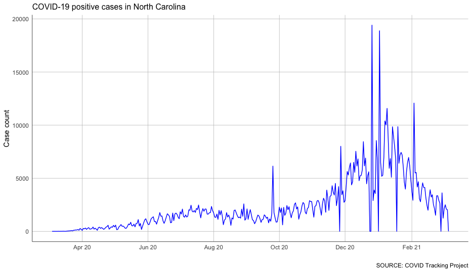
That’s… spiky. And even more complicated.
One way to smooth out the jitter is to take a rolling average.
For that, we’ll use a function from our zoo package to calculate that average over 7 days. It’s called rollmean(), and it accepts a few parameters that tell it how we want to calculate our rolling window.
Let’s use this function to calculate the rolling average of new cases in North Carolina in a new dataframe. We’ll also use the select() function from the tidyverse to simplify our dataframe a bit.
And because we don’t want to have fractions of a case in our data, we’re going to round the resulting rolling average to the nearest whole number.
#calculate rolling average of new cases as a new column
covid_nc_rolling <- covid_nc %>%
  select(date, positiveIncrease) %>%
  mutate(rolling_new = rollmean(positiveIncrease, #specify our variable
             7, #calculate over seven days
             fill = NA, #ignore if there are blank cells
             align = "right"), #set the direction we want our rolling window to go
         rolling_new = round(rolling_new) #round the variable to the nearest whole number
         )
With that column calculated, we can chart our case growth again – and see the trends much more clearly.
#chart the rolling average of cases in North Carolina
covid_nc_rolling %>%
  ggplot(aes(date, rolling_new)) + #define the x and y axes
  geom_line(color = 'blue') + #make a line chart and define the color
  scale_x_date(date_breaks = '2 months', date_labels = "%b %y") + #specify a date interval
  labs(title = "COVID-19 positive cases in North Carolina", #label our axes
       caption = "SOURCE: COVID Tracking Project",
       x = "",
       y = "Case count") +
  theme(strip.text.x = element_text(size = 10), #do a little styling
        strip.background.x = element_blank(),
        axis.line.x = element_line(color="black", linewidth = 0.25),
        axis.line.y = element_line(color="black", linewidth = 0.25),
        panel.grid.major.x = element_line( color="grey", linewidth = 0.25 ),
        panel.grid.major.y = element_line( color="grey", linewidth = 0.25 ),
        axis.ticks = element_blank(),
        panel.background = element_blank(),
        plot.title = element_text(size = 12),
  )
Not bad at all!
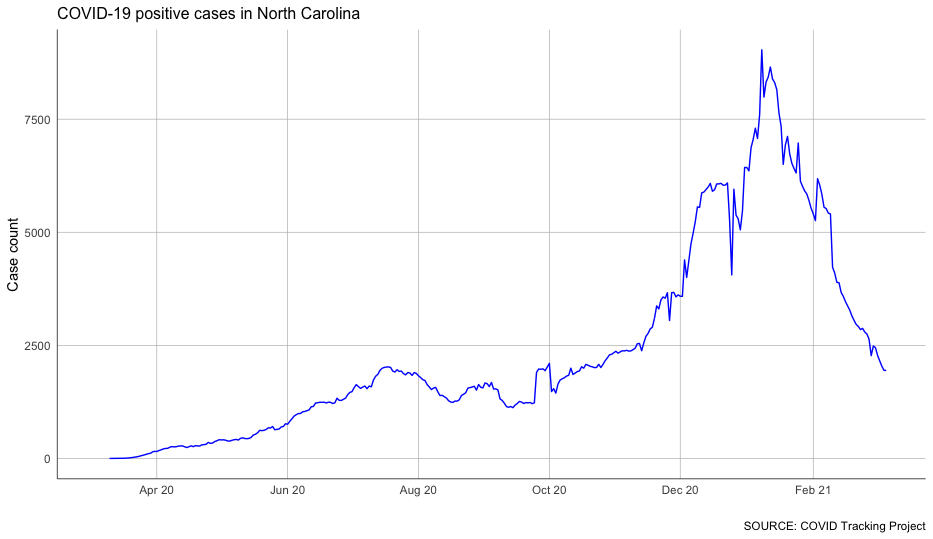
You can see some clear impacts of a few different periods of COVID-19 surges.
Combining different geoms
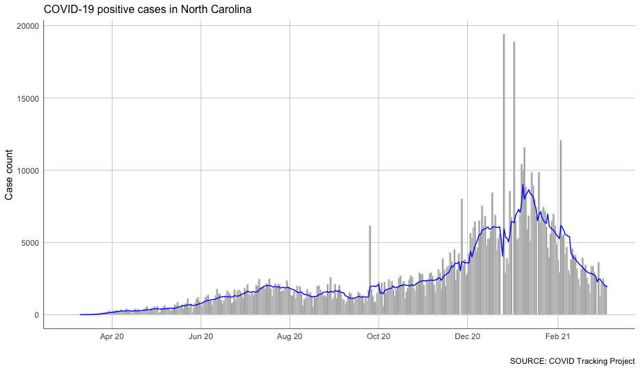
Because ggplot is built on the idea that we can add things layer by layer, we don’t necessarily have to choose between the spikiness of our day-to-day changes and the overly smooth 7-day averages.
There may be trends we want to see in both!
Let’s create a visualization that differentiates between our daily increases and averages with a bar chart and a line chart, together.
To do that, we’ll need to move our aes() function down to our geom – we’re feeding in different definitions of our X and Y axis, after all.
We’ll also make use of the stat parameter, which allows us to layer the data one on top of the other.
#combine a bar and line chart with identity
covid_nc_rolling %>%
  ggplot() + #define the x and y axes
  geom_bar(aes(date, positiveIncrease), stat = 'identity', color = 'lightgrey') + #move the aesthetic down to the geom
  geom_line(aes(date, rolling_new), stat = 'identity', color = 'blue') + #include the stat parameter
  scale_x_date(date_breaks = '2 months', date_labels = "%b %y") + #specify a date interval
  labs(title = "COVID-19 positive cases in North Carolina", #label our axes
       caption = "SOURCE: COVID Tracking Project",
       x = "",
       y = "Case count") +
  theme(strip.text.x = element_text(size = 10), #do a little styling
        strip.background.x = element_blank(),
        axis.line.x = element_line(color="black", linewidth = 0.25),
        axis.line.y = element_line(color="black", linewidth = 0.25),
        panel.grid.major.x = element_line( color="grey", linewidth = 0.25 ),
        panel.grid.major.y = element_line( color="grey", linewidth = 0.25 ),
        axis.ticks = element_blank(),
        panel.background = element_blank(),
        plot.title = element_text(size = 12),
  )
Patterns in small multiples
What if we want to take a broader look at states other than North Carolina?
With a few small tweaks to our code, we can apply the steps we used for North Carolina to all other states at once:
- order each state by date
- group by state so our rolling averages are only calculated within each state
- select only the columns we need
- calculate and round our rolling average
#calculate rolling averages for each state
covid_rolling <- covid_time_series %>%
  arrange(state, date) %>% #arrange by state, then date
  group_by(state) %>% #group by state so our rollmean doesn't average different states
  select(state, date, positiveIncrease) %>% #simplify our data
  mutate(rolling_new = rollmean(positiveIncrease, #specify our variable
                                7, #calculate over seven days
                                fill = NA, #ignore if there are blank cells
                                align = "right"), #set the direction we want our rolling window to go
         rolling_new = round(rolling_new) #round the variable to the nearest whole number
  )
Now, anytime we want to focus on a single state, we can just apply a simple filter to the new variable.
#try filtering for a state
covid_rolling %>%
  filter(state == 'NY') #choose a state with the filter
But we can also graph all of these states at once to see how they compare.
To do that, we’ll need to add another variable to our aes() function – color.
Defining our X and Y axes, like we’ve done so far, allows us to visualize two dimensions. Adding a color category gives us a third dimension.
But as you’ll see, that extra dimension has its limitations.
Note that the following code looks pretty similar to what we’ve seen so far, with the exception of our aes tweak and the removal of the color definition from our geom_line().
#create a line chart for all states' rolling averages of new cases
covid_rolling %>%
  ggplot(aes(date, rolling_new, color = state)) + #define the x and y axes - and color
  geom_line() + #make a line chart - no color definition this time
  scale_x_date(date_breaks = '2 months', date_labels = "%b %y") + #specify a date interval
  labs(title = "COVID-19 positive cases in US states", #label our axes
       caption = "SOURCE: COVID Tracking Project",
       x = "",
       y = "Case count") +
  theme(strip.text.x = element_text(size = 10), #do a little styling
        strip.background.x = element_blank(),
        axis.line.x = element_line(color="black", linewidth = 0.25),
        axis.line.y = element_line(color="black", linewidth = 0.25),
        panel.grid.major.x = element_line( color="grey", linewidth = 0.25 ),
        panel.grid.major.y = element_line( color="grey", linewidth = 0.25 ),
        axis.ticks = element_blank(),
        panel.background = element_blank(),
        plot.title = element_text(size = 12),
  )
And there we have all 50 states plus territories scrambled together in a rainbow jumble.
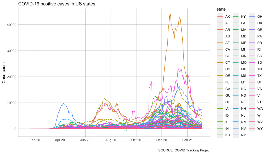
But that’s about as unhelpful as it is ugly.
Instead of looking at everything on the same plot, let’s use small multiples.
This approach splits the chart across many different, smaller charts. We’ll lose some precision, but it will be much, much easier to examine on a comparative basis (at least, theoretically).
The geofacet package has a great function called facet_geo() that can plot these small multiples.
We can even choose from a long list of predefined grids that roughly translate to the geographic locations of features like counties, states or countries (you can even design and submit your own grid for inclusion in the library).
In this case, we’re going to use a predefined grid for the United States.
#create a geofacet across US states
covid_rolling %>%
  ggplot(aes(date, rolling_new)) + #define the x and y axes - no color this time
  geom_line(color = 'blue') + #make a line chart, and add the color back
  facet_geo(~state, grid = "us_state_grid2") + #facet over a predefined US grid
  scale_x_continuous(labels = NULL) + #specify we want a continuous (number) scale
  labs(title = "COVID-19 positive cases in North Carolina", #label our axes
       caption = "SOURCE: COVID Tracking Project",
       x = "",
       y = "Case count") +
  theme(strip.text.x = element_text(size = 10), #do a little styling
        strip.background.x = element_blank(),
        axis.line.x = element_line(color="black", linewidth = 0.25),
        axis.line.y = element_line(color="black", linewidth = 0.25),
        panel.grid.major.x = element_line( color="grey", linewidth = 0.25 ),
        panel.grid.major.y = element_line( color="grey", linewidth = 0.25 ),
        axis.ticks = element_blank(),
        panel.background = element_blank(),
        plot.title = element_text(size = 12),
  )
This should show up in your plot pane, but it’s probably worth pressing the “Zoom” button to pop the graphic out into a separate window so you can examine it a little better.
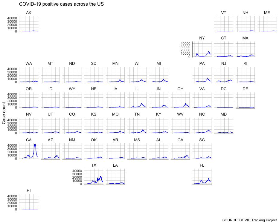
Pretty interesting.
But you might notice the huge spike in California – which at one point was adding around 40,000 cases a day – is making the other states with smaller raw numbers harder to see.
So let’s introduce a variable axis that rescales each chart based on its respective minimums and maximums.
There’s something of a tradeoff here: A variable axis can obscure big relative changes in small numbers. But we’re interested – at least in this stage – at understanding the shape of the curve, not necessarily its exact magnitude.
Because we want to keep that potential misinterpretation in mind, let’s remove the y-axis labels and focus on the curve alone.
#create a geofacet across US states with a variable access
covid_rolling %>%
  ggplot(aes(date, rolling_new)) + #define the x and y axes - no color this time
  geom_line(color = 'blue') + #make a line chart, and add the color back
  facet_geo(~state, grid = "us_state_grid2", scales="free_y") + #the free_y gives our charts a variable axis
  scale_x_continuous(labels = NULL) + #specify we want a continuous (number) scale
  labs(title = "COVID-19 positive cases across the US", #label our axes
       caption = "SOURCE: COVID Tracking Project",
       x = "",
       y = "Case count") +
  theme(strip.text.x = element_text(size = 10), #do a little styling
        strip.background.x = element_blank(),
        axis.ticks = element_blank(),
        axis.text.y = element_blank(), #remove the y axis labels for space
        panel.background = element_blank(),
        plot.title = element_text(size = 12),
  )
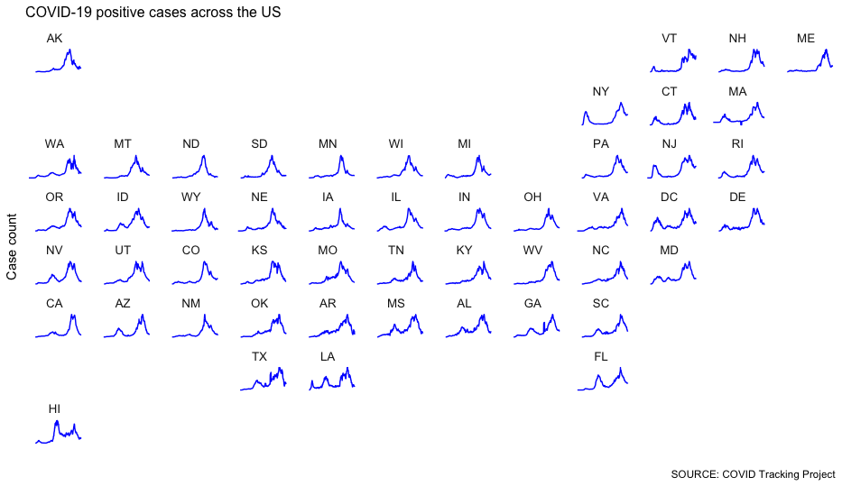
One thing we can tell: There was a record-breaking spike in pretty much every state toward the end of the period we’re tracking.
We still have a fidelity problem – this technique makes the magnitude hard to understand. But we can still observe things from the shape of the spike that might raise questions.
Get the full script
Download the full script for this walkthrough here.